The 2017 Round-Up: Wonderful Weddings

2017-12-30_0059.jpg

Right, well, where the heck do I start here? This year’s weddings have been, in a word, spectacular. I’ve photographed wedfests, funfairs, snow, unicorns riding on dodgems, big hounds, little hounds, alpacas, tears, giggles and more beautiful people than I could ever possibly have imagined. Thank you SO, SO MUCH to all of my incredible clients this year, it really has been an absolute joy working with you. After an awful end to 2016 for my family, this year could have been a particularly difficult one for me – but you guys have helped put my heart back together in the most wonderful way. With everything I have, thank you.

Now, to the photos! (If you’re a Spotify user, I’m going to go right ahead and recommend you pop this playlist of loveliness/pure cheese on while you’re browsing.)

2017-12-30_0010.jpg

The wedding location and detail game was pretty excellent again this year. I travelled all over the UK and, I’ll not lie, delighted at all the northern & nerdy details. Ten points, couples!

2017-12-30_0006.jpg2017-12-30_0008.jpg2017-12-30_0012.jpg2017-12-30_0007.jpg

Dogs at weddings was a much-welcomed theme again:

2017-12-30_0009.jpg

And this year I got to play with goats and alpacas too! Oh my days, it was amazing. Here’s what beautiful Charlie & Steve looked like surrounded by their new pals:

2017-12-30_0068.jpg

Annnnd here’s what was going on behind the scenes (big thanks to Sam Houghton for these!):

My couples were bloody gorgeous and I love them forever for humouring me as I played with prisms and fairy lights and hid behind bushes and othersuch madness:

Clem & Grant by www.el-hitched.co.ukSam & Mim by www.el-hitched.co.ukLauren & Mark by www.el-hitched.co.ukMik & John by www.el-hitched.co.ukClaire & Jim by www.el-hitched.co.uk

Adobe Spark

Mr & Mrs Smart by www.el-hitched.co.ukLauren & Greg by www.el-hitched.co.ukLauren & Nick by www.el-hitched.co.ukThomas & Niamh by www.el-hitched.co.ukKatie & Stew by www.el-hitched.co.uk

Adobe Spark (1)

Lauren & Greg by www.el-hitched.co.ukRachel & Paddy by www.el-hitched.co.ukAndi & Emily by www.el-hitched.co.ukSimon & Chanelle by www.el-hitched.co.ukAnna & Chris by www.el-hitched.co.ukKatie & Stew by www.el-hitched.co.uk

Adobe Spark (2)

Jo & Ollie by www.el-hitched.co.ukAmy & Adam by www.el-hitched.co.ukEd & Sarah by www.el-hitched.co.ukCharlotte & Chay by www.el-hitched.co.ukEilidh & Tom by www.el-hitched.co.uk

The way you all looked at your loved ones melted my heart on more than one occasion:

Simon & Chanelle by www.el-hitched.co.ukMr & Mrs Smart by www.el-hitched.co.ukLauren & Nick by www.el-hitched.co.ukKatie & Stew by www.el-hitched.co.ukOllie & Joanna by www.el-hitched.co.ukEilidh & Tom by www.el-hitched.co.ukAnna & Chris by www.el-hitched.co.uk

And we had a whole lot of fun too. Y’know, in between the emotional carnage:

Amy & Adam by www.el-hitched.co.ukAnna & Chris by www.el-hitched.co.ukClaire & Jim by www.el-hitched.co.ukMik & John by www.el-hitched.co.ukRachel & Paddy by www.el-hitched.co.ukEilidh & Tom by www.el-hitched.co.ukClaire & Jim by www.el-hitched.co.ukAdobe Spark (4)Mik & John by www.el-hitched.co.ukAndrew & Joel by www.el-hitched.co.ukAdobe Spark (5)Claire & Jim by www.el-hitched.co.ukMik & John by www.el-hitched.co.ukEd & Sarah by www.el-hitched.co.ukAdobe Spark (3)Mik & John by www.el-hitched.co.ukClaire & Jim by www.el-hitched.co.ukLauren & Mark by www.el-hitched.co.ukThomas & Niamh by www.el-hitched.co.ukAmy & Adam by www.el-hitched.co.uk

I think we can safely establish that these guys all had an absolute whale of a time:

Charlotte & Chay by www.el-hitched.co.ukCharlotte & Chay by www.el-hitched.co.ukEd & Sarah by www.el-hitched.co.ukThomas & Niamh by www.el-hitched.co.ukEL-Hitched - kids at weddings (6)

The force was strong in the ol’ group photo antics:

Ollie & Joanna by www.el-hitched.co.ukLauren & Mark by www.el-hitched.co.ukKatie & Stew by www.el-hitched.co.ukCharlotte & Chay by www.el-hitched.co.ukSam & Mim by www.el-hitched.co.ukJo & Ollie by www.el-hitched.co.uk

(Pose level: HEROIC.)

I turned into a soppy whatsit every time this happened:

Andi & Emily by www.el-hitched.co.ukLauren & Mark by www.el-hitched.co.ukMr & Mrs Smart by www.el-hitched.co.uk

HEART=WARMED.

Annnnd what’s left? Oh. Oh I know.

Ollie & Joanna by www.el-hitched.co.ukCharlotte & Chay by www.el-hitched.co.ukMik & John by www.el-hitched.co.ukThomas & Niamh by www.el-hitched.co.ukClaire & Jim by www.el-hitched.co.uk

AS IF I’D FORGET THE DANCING.

Thank you so much again to all the lovely folk at this year’s weddings; couples, guests, venue staff, suppliers and all – I hope you know how much you, along with my wonderful second-shooters, brightened up my year. Huge love to the lot of you!

If you’re getting hitched in 2018/19 and like what you see, get in touch! If you’re getting wed in Derbyshire / South Yorkshire, I’ll even give you 15% off the full-day package. ***If you’re eloping or having a tiny intimate ceremony and would like to arrange some custom hours, I would especially love to hear from you! Give me a shout here for some special rates.***

All the very best for 2018,

Elly xxx

The 2016 Round-Up: Music & Portraits & Things

Seeing as I went ahead and did an absolutely mammoth wedding round-up blog for this year, it only seemed right and fair to show you a few of my favourites from my various other photo & design adventures.

This year has been a brilliant year of tinkering. It’s been a year of working with lots of awesome clients who trust you implicitly to go a bit rogue and get your creative on and ohmygosh I love them for it. (Y’know, the kind of folk who don’t bat an eyelid when you’re running around using a pint glass / coloured knitting needles / trees as a creative filter. Those ones.) I’ve travelled all over, fallen in love with SNAP Photography Festival, painted faces and had far too much fun running around with some of my favourite photographers and musicians.

Now, with no further ado, here we go…

Emily Mae Winters - EP cover.jpg2016-12-27_0012.jpg

EP design for the lovely Emily Mae Winters, followed later in the year by an album shoot which may have involved a paddling pool. In November. Go check out her Facebook page for album updates!

2016-12-27_0016.jpg2016-12-27_0015.jpg2016-12-27_0017.jpg2016-12-27_0018.jpg

Promo photos around Kelham Island for musician / composer extraordinaire Jack McNeill.

2016-12-27_0009.jpg2016-12-27_0010.jpg

A portrait session in Liverpool with the wonderful Eleanor Rees.

2016-12-27_0019.jpg

Photoshoot adventures around Stannington / Dungworth with Jack Rutter. Keep an eye out on Jack’s page for more from this session!

2016-12-27_0014.jpg2016-12-27_0013.jpg

That time beautiful Heidi Talbot invited me up to Scotland to take photos for her new album “Here We Go 1, 2, 3” around the spectacular Glen House Estate.

2016-12-27_0007.jpg

Promo session for Coven (featuring Lady Maisery, Belinda O’Hooley & Tidow and Grace Petrie).

2016-12-27_0005.jpg2016-12-27_0006.jpg2016-12-27_0004.jpg

Epic Shakespeare-themed portrait adventures with The Company Of Players.

KB Absent Mother - FRONT COVER JPG rgb.jpg

Photography and artwork for Kirsty Bromley‘s new EP “Absent Mother”.

2016-12-27_0046.jpg2016-12-27_0047.jpg

That time we ran riot at CADS Sheffield with vast volumes of vintage and steampunk wonderfulness for the Steamchicken album photoshoot.

2016-12-27_0048.jpg2016-12-27_0050.jpg2016-12-27_0049.jpg

Portrait adventures in the woods with electroacoustic genius Vanessa Massera.

2016-12-27_0029.jpg2016-12-27_0028.jpg

Tinkerings with prisms and a video light for the rather marvellous Ollie King‘s upcoming new album “Diffractions”.

Son Of John - COVER hi-res.jpg

Album photography and design for Son Of John‘s debut album “Autumn’s Hymn”.

2016-12-27_0031.jpg2016-12-27_0030.jpg

Portrait session for the mega gorgeous Phoebe Eley above the Longshaw Estate, Derbyshire.

2016-12-27_0023.jpg2016-12-27_0024.jpg2016-12-27_0025.jpg

That time I popped over to Bergen, Norway, with Jamie Sia Photography to wear beautiful dresses by Luna Organics and take a few snaps of our other lovely models Jess Johnston and Eric Odeen.

2016-12-27_0032.jpg2016-12-27_0033.jpg2016-12-27_0035.jpg2016-12-27_0034.jpg

The time I ran around as an official snapper (super fit low-vis blue tabard and all) at Shrewsbury Folk Festival. If you’re looking for an awesome music festival to take your family to (or just to go to for funsies!) I can’t recommend this one enough.

2016-12-27_0044.jpg2016-12-27_0045.jpg

Creative photoshoot adventures for the brilliant Will Pound & Eddy Jay‘s new album “Ignite”, featuring a painting by Will’s brother, Steve Pound.

2016-12-27_0003.jpg

Bellowhead‘s new live album (recorded by my genius old housemate Andy Bell) came out, so you finally get to see the snaps I took for it at their Manchester 02 Apollo gig last year. Poot poot!

2016-12-27_0021.jpg2016-12-27_0022.jpg

Promo snaps for melodeon marvel Mel Biggs, complete with multicoloured knitting needle filter. Obvs. (I may have squeaked with happiness a bit.)

2016-12-27_0051.jpg

That time I did a photoshoot for Weleda‘s beautiful new gift range for their Christmas catalogue. In September. Christmas music and fairy lights may have featured heavily.

2016-12-27_0036.jpg2016-12-27_0037.jpg

The time it snowed and Shelley Richmond and I decided to frolic around in tulle skirts in the Peak District.

2016-12-27_0043.jpg2016-12-27_0039.jpg2016-12-27_0040.jpg2016-12-27_0041.jpg

When SNAP Photography Festival was everything I hoped it would be and more. Photographers, if you want to join one of the best communities of creative folk in the known universe, go give the SNAP website a visit!

2016-12-27_0002.jpg

…and that, dear readers, was 2016! Thank you to all of my incredible clients and peers, and to all of you for your kind support.

Love to the lot of you,

E x

The 2016 Round-Up: EPIC Weddings

Right, where the hell do I start with this then? 2016 was an AMAZING year for weddings, there’s no other word for it. My clients were infallibly wonderful, I got to travel all over the shop and my second shooters have been absolute diamonds. I’m going to go ahead and inform you straight away that the force was not strong in this one during my attempts to cull the photo selection for this blog. My expression was, in fact, remarkably similar to this little lady:

2016-12-16_0019.jpg

…right up until I decided to just give in and go wild and just show you as many snaps as I darn well pleased. While I’m not actually sorry because this blog is now stacked with adorableness, you may want to grab yourself a brew and settle in. (Oh, and if you’re a Spotify user, I’m going to recommend you pop this playlist of loveliness on too.)

Ready? Let’s GO.

2016-12-15_0043.jpg

As well as getting to shoot at some brilliant local venues in Derbyshire and South Yorkshire this year (Wortley Hall, Wentworth Castle and Newton Solney Barns to name a few), my travels have taken me everywhere from Orkney to Windermere to Paris and beyond! I’ve been rendered absolutely speechless by the beauty not only of the places I’ve had the privilege of snapping, but of the people I’ve encountered along the way too.

2016-12-15_0049.jpg2016-12-15_0014.jpg2016-12-16_0034.jpg2016-12-15_0022.jpg2016-12-15_0034.jpg2016-12-15_0051.jpg2016-12-15_0018.jpg

There were some excellent prep moments:

2016-12-16_0003.jpg2016-12-16_0012.jpg2016-12-16_0016.jpg2016-12-16_0008.jpg2016-12-16_0011.jpg2016-12-16_0013.jpg2016-12-16_0007.jpg2016-12-16_0009.jpg2016-12-16_0040.jpg2016-12-16_0032.jpg2016-12-16_0041.jpg2016-12-16_0014.jpg

The details were next level:

2016-12-15_0055.jpg2016-12-15_0039.jpg2016-12-15_0056.jpg2016-12-15_0057.jpg2016-12-15_0053.jpg2016-12-15_0054.jpg2016-12-15_0060.jpg2016-12-15_0048.jpg2016-12-15_0059.jpg2016-12-15_0047.jpg2016-12-15_0062.jpg2016-12-15_0066.jpg

There were a few strokes of pure genius, including these little picnic crates as the wedding breakfast, a hangover kit for the bridal party, tables sorted into Hogwarts houses and – oh happiest of days – a tea bar!

2016-12-15_0064.jpg2016-12-15_0067.jpg2016-12-15_0042.jpg2016-12-15_0063.jpg

The flowers were magic:

2016-12-15_0040.jpg2016-12-15_0045.jpg

There were some stellar staircase moments:

2016-12-16_0029.jpg2016-12-16_0028.jpg2016-12-16_0052.jpg

And my couples were all so gorgeous that it made me giddy. Photographing people in love = quite possibly the best job in the world.

2016-12-15_0009.jpg2016-12-15_0028.jpg2016-12-15_0015.jpg2016-12-15_0008.jpg2016-12-15_0012.jpg2016-12-15_0006.jpg2016-12-15_0007.jpg2016-12-15_0023.jpg2016-12-15_0019.jpg2016-12-15_0037.jpg2016-12-16_0024.jpg2016-12-16_0023.jpg2016-12-16_0056.jpg2016-12-15_0026.jpg2016-12-15_0017.jpg2016-12-15_0033.jpg2016-12-15_0010.jpg2016-12-15_0036.jpg

Dogs at weddings was a glorious, glorious thing:

2016-12-15_0069.jpg2016-12-15_0071.jpg2016-12-15_0073.jpg2016-12-15_0075.jpg

I had far too much fun with group photos:

2016-12-15_0105.jpg2016-12-15_0102.jpg2016-12-15_0096.jpg2016-12-15_0100.jpg2016-12-15_0104.jpg2016-12-15_0098.jpg2016-12-15_0109.jpg

I lost count of the number of times my heart melted:

2016-12-16_0002.jpg2016-12-16_0035.jpg2016-12-16_0018.jpg2016-12-16_0030.jpg2016-12-16_0053.jpg2016-12-16_0051.jpg2016-12-16_0031.jpg2016-12-16_0006.jpg2016-12-16_0001.jpg2016-12-16_0046.jpg2016-12-16_0017.jpg2016-12-16_0047.jpg

The confetti game was strong:

2016-12-15_0002.jpg2016-12-15_0001.jpg2016-12-15_0003.jpg2016-12-15_0004.jpg

The speech reactions were genius:

2016-12-16_0033.jpg

The victory stance was a recurring theme:

2016-12-16_0005.jpg

…and have I mentioned how SPECTACULAR the wedding games were this year yet? Oh my. Oh my life. Groomsmen challenges, rounders, sack races, bingo, space hoppers and beyond. Just look at this:

2016-12-15_0084.jpg2016-12-15_0087.jpg2016-12-15_0089.jpg2016-12-15_0090.jpg2016-12-15_0079.jpg2016-12-15_0082.jpg2016-12-15_0088.jpg2016-12-15_0081.jpg2016-12-15_0083.jpg2016-12-15_0094.jpg2016-12-16_0038.jpg

FINALLY, it only seems fitting to end a wedding blog with some classic dance floor antics. We’re talking everything from the macarena to ceilidh dancing, air guitar-ing to being hoisted into the air on chairs. 2016 couples, you guys had some serious moves:

2016-12-15_0112.jpg2016-12-15_0113.jpg2016-12-15_0115.jpg2016-12-15_0119.jpg2016-12-15_0111.jpg2016-12-15_0116.jpg2016-12-15_0120.jpg2016-12-15_0114.jpg2016-12-15_0121.jpg2016-12-15_0122.jpg2016-12-15_0123.jpg

And there you have it! 2016 in a photographic nutshell. Thank you so much to all of my gorgeous clients from this year, I can’t tell you what a delight it’s been and I wish you all the very best for the new year and beyond. Additional thanks must go to my wonderful second-shooters this year (Sam Houghton, Helen Smiddy, Liz Wan, Louise Pawson, Louise Bichan, Daniel Naylor and Kim Gribbon) and to all of the lovely suppliers and venues I’ve worked with over the year, you guys are the bee’s knees.

If you’re getting hitched in 2017 and like what you see, get in touch! Lots more info, package deals and more, can be found on my website.

If you know someone who’s getting hitched in 2017 and might like my work, sharing this blog with them could win you a free couple photoshoot! If I get a booking which cites you as the source of the referral, I’ll send you a nice little couple photoshoot voucher to say thank you. This offer is valid until April 1st 2017. Enjoy!

Huge love and best wishes to you all,

E xx

That time my old school pals got hitched avec Harry Potter decor and it was amazing.

Ross & Amy by www.el-hitched.co.uk

“Elly, we cannot thank you enough for your amazingly hard work photographing our wedding day. You were a delight to deal with from day-one, and completely got on board with our theme and the atmosphere that we wanted to create, and we’re so thankful for your enthusiasm! Yourself and Helen were a lovely, calming presence on the day but were never ‘in the way’ or overbearing, and you let us relax and enjoy our day which was so important to us. And the photos you’ve produced are insanely beautiful, you managed to make an awkward, not-very-photogenic couple look pretty decent! They capture the lovely moments perfectly, we cannot stop looking at them and reminiscing about the day. You worked so so hard, and we can’t tell you how grateful for the beautiful keepsakes that you’ve given us.”

#HEARTMELTED

There’s something particularly lovely about getting to snap the wedding of some of your old school pals. There’s something even lovelier about getting to snap the wedding of old school pals who love the Harry Potter books as much as you do and they include that love in the decor theme to the extent that it causes you to squeak and clap like the happiest seal at literally every detail. I’ve decided I’m not actually going to blabber on too much at the start of this blog because it might ruin the (GLORIOUS) surprises, but – seriously – if you’re a Potter fan, grab a butterbeer and keep reading / prepare to happy cry.

Mr & Mrs Hathaway, I salute you both, you spectacular humans.

Ross & Amy by www.el-hitched.co.ukRoss & Amy by www.el-hitched.co.ukRoss & Amy by www.el-hitched.co.ukRoss & Amy by www.el-hitched.co.ukRoss & Amy by www.el-hitched.co.ukRoss & Amy by www.el-hitched.co.uk

“…but Elly, there’s no sign of any Harry Potter wonderfulness yet!”

BOOM! Hogwarts house seating plan and co-ordinating house colour table decor, anyone?

Ross & Amy by www.el-hitched.co.uk

Ross & Amy by www.el-hitched.co.uk

Ross & Amy by www.el-hitched.co.uk

Ross & Amy by www.el-hitched.co.uk

Ross & Amy by www.el-hitched.co.uk

Ross & Amy by www.el-hitched.co.uk

❤❤❤ 

While you’re hyperventilating with joy, we’ll take a brief break from the Potter theme and dive straight back in to some more general gorgeousness. Ready?

Ross & Amy by www.el-hitched.co.uk

Personalised tea as favours = actual wizardry.

Ross & Amy by www.el-hitched.co.uk

Ross & Amy by www.el-hitched.co.uk

Ross & Amy by www.el-hitched.co.uk

Ross & Amy by www.el-hitched.co.uk

Ross & Amy by www.el-hitched.co.uk

Ross & Amy by www.el-hitched.co.uk

Ross & Amy by www.el-hitched.co.uk

Ross & Amy by www.el-hitched.co.uk

Ross & Amy by www.el-hitched.co.uk

Ross & Amy by www.el-hitched.co.uk

Ross & Amy by www.el-hitched.co.uk

In case you’re wondering, this venue is the Donnington Park Farmhouse in Castle Donnington, Derbyshire and it technically just qualifies for my 15% locals’ discount. Juuust so you know.

Ross & Amy by www.el-hitched.co.uk

Ross & Amy by www.el-hitched.co.uk

Ross & Amy by www.el-hitched.co.uk

Ross & Amy by www.el-hitched.co.uk

Ross & Amy by www.el-hitched.co.uk

Ross & Amy by www.el-hitched.co.uk

Ross & Amy by www.el-hitched.co.uk

Ross & Amy by www.el-hitched.co.uk

Ross & Amy by www.el-hitched.co.uk

Ross & Amy by www.el-hitched.co.uk

Ross & Amy by www.el-hitched.co.uk

Ross & Amy by www.el-hitched.co.uk

Ross & Amy by www.el-hitched.co.uk

One super adorable ceremony (avec delightful English popular literature-themed reading) later, I stole the new Mr & Mrs away for some nice couple portraits.

Ross & Amy by www.el-hitched.co.uk

Ross & Amy by www.el-hitched.co.uk

Ross & Amy by www.el-hitched.co.uk

Ross & Amy by www.el-hitched.co.uk

Ross & Amy by www.el-hitched.co.uk

Ross & Amy by www.el-hitched.co.uk

Ross & Amy by www.el-hitched.co.uk

Ross & Amy by www.el-hitched.co.uk

Ross & Amy by www.el-hitched.co.uk

Ross & Amy by www.el-hitched.co.uk

Ross & Amy by www.el-hitched.co.uk

Ross & Amy by www.el-hitched.co.uk

Ross & Amy by www.el-hitched.co.uk

Can we just take a moment to appreciate the dress and suit game here? Oh my ♥

Ross & Amy by www.el-hitched.co.ukRoss & Amy by www.el-hitched.co.ukRoss & Amy by www.el-hitched.co.ukRoss & Amy by www.el-hitched.co.ukRoss & Amy by www.el-hitched.co.ukRoss & Amy by www.el-hitched.co.uk

How beautiful is that barn setup?! If these details weren’t enough for you, WATCH OUT POTTER FANS, one of my all time favourite sweet cart setups was being put into action whilst dinner was happening. Take a deep breath, guys, and prepare to swoon slightly.

Ross & Amy by www.el-hitched.co.ukRoss & Amy by www.el-hitched.co.ukRoss & Amy by www.el-hitched.co.ukRoss & Amy by www.el-hitched.co.ukRoss & Amy by www.el-hitched.co.uk

YES, THAT’S A HARRY POTTER THEMED SWEET CART. BE STILL, MY BEATING HEART. I’ll not lie, I took far more photos of this than was strictly necessary. Massive shout out to the lovely Simply Sweet – Sweet Cart Hire for their work putting this together, it looked amazing!

Ross & Amy by www.el-hitched.co.ukRoss & Amy by www.el-hitched.co.ukRoss & Amy by www.el-hitched.co.ukRoss & Amy by www.el-hitched.co.uk

One veritable confetti explosion later and it was party time. I tell you now, these guys had some moves. How perfect is the Donnington Park Farmhouse barn for the Potter theme party too?!

Ross & Amy by www.el-hitched.co.ukRoss & Amy by www.el-hitched.co.ukRoss & Amy by www.el-hitched.co.ukRoss & Amy by www.el-hitched.co.ukRoss & Amy by www.el-hitched.co.ukRoss & Amy by www.el-hitched.co.ukRoss & Amy by www.el-hitched.co.ukRoss & Amy by www.el-hitched.co.ukRoss & Amy by www.el-hitched.co.ukRoss & Amy by www.el-hitched.co.ukRoss & Amy by www.el-hitched.co.ukRoss & Amy by www.el-hitched.co.uk

Whew, what a day!!! Big thanks to the brilliant Helen Smiddy for being my second shooter here and to the ace staff at Donnington Park Farmhouse for looking after us.

And finally, to finish: Huge congratulations again, lovely Amy and Ross, and thank you for asking me along to capture things for you! It really was, absolutely genuinely, magic.

E x


If you like what you see and would potentially like me to cover your big day, get in touch! See my website for an extended portfolio, pricing and contact details: www.el-hitched.co.uk


She spoke to the birds and they sang in return.

2016-09-19_0004

So here’s a shoot I’ve been meaning to blog for AGES. I was delighted when the phenomenal Kate in the Kettle got in touch about doing a little creative collaboration, especially when she turned up with what I can only describe as the props box of dreams. (It’s entirely possible that I squeaked and clapped like a seal when that appeared out of the car. Not even going to deny it.) This was a shoot with an awesome amount of creative freedom, featuring everything from fairy doors to giant origami to hair floristry and beyond, and my goodness it was fun!

As well as procuring a few props, Kate and I both decided to make a couple of things to feature in this photoshoot. Kate created these incredible critters:

2016-09-19_0001

And I decided to put together a tiny bird’s house for Kate to wear on her head. Because, well, why the heck not?

2016-09-19_0005

Hair and make-up was done by myself and the images were edited using a combination of Photoshop and Alien Skin Exposure for that extra film-like colour grade. The location was a lovely bit of woodland out towards Dungworth, Sheffield, and all of the images were shot using a 50mm prime lens on a Canon 5DmkIII.

2016-09-19_00122016-09-19_00082016-09-19_0007

If you haven’t heard Kate’s beautiful, otherwordly brand of music before, be sure to go treat your ears to her Bandcamp page.

2016-09-19_00022016-09-19_00062016-09-19_00112016-09-19_0010

Creative collaborations = good for the soul. It’s such a delight working with folk who dive into wild visual ideas with both feet and get as giddy about them as you do.

2016-09-19_0009

For more info and updates about Kate’s various projects, head on over to her Facebook page and the Songs of Separation website. If you like what you hear, you could even help Kate record her new album! She’ll be posting little bits of new exciting videos and songs over on Patreon and, for whatever you can manage to contribute, you’ll be able to access the posts and help her create the new album all at the same time. Magic stuff.

Until next time,

E x

Peak District Adventures: Episodes 1-6

Longshaw (8).jpg

So here’s a thing: Being a self-employed photographer can sometimes feel a bit like you’re socially bi-polar. The chances are you’ve either got your best extroverted, socially capable face on while you’re dashing around snapping beautiful weddings / festivals / bands / whatever your bag is or you are, quite probably, sat on your tod in the photographic equivalent of the bat cave. Possibly with the curtains closed if it’s mega sunny so it doesn’t screw with your white-balance perception. (Not even kidding.) As you can imagine, this can get a wee bit intense during particularly busy times of the year and it can be mighty difficult to talk about it to anyone who works outside the scene: to the vast majority of people we’re doing our freakin’ dream job. Which we are. But that doesn’t mean it’s not a serious labour of love sometimes, right?

…and that’s where the Peak District Adventures came in. Originally these began as an excuse for a load of lovely internet acquaintances to meet up ahead of going to the awesome Snap Photography Festival together, but we ended up having so much fun at the first one that the brilliant Will Fuller Photography and I took it upon ourselves to try and organise one every month or so. Turns out that fresh air + actual proper daylight + beautiful scenery + good company = much happier photographers. Who knew?! (Imagine drinks or dinner after work but with extra vitamin D and a whole load of cameras / general nerdery. Chuffing marvellous.)

Longshaw (29).jpg

Having a support network of people around you who understand the scene you work in is one of the best things you can possibly have. Don’t get me wrong here, I absolutely adore all of my friends and family outside of the circles I work in, but having people who can truly empathise and advise, who you trust implicitly to cover for you in an emergency and have your back when things are difficult – there’s nothing quite like it. Find your tribe and love ’em like crazy, this world is so much better when we support each other instead of competing all the time.

Now, to the photos!


EPISODE I: Longshaw Estate, Dec ’15

That time we nearly got blown away on the moors but it was super pretty and we got pie at the pub. Oh hell yes.

Longshaw (3)Longshaw (10)Longshaw (11)Longshaw (13)

2016-08-04_00012016-08-04_00022016-08-04_0003

Photographers: Will Fuller, Becky Kelly, Louise Pawson (Fox Tail Photography)

12356997_10207227887191430_1565106603772754300_o


EPISODE II: Mam Tor, Jan ’16

That time we went on a slightly longer walk than anticipated and realised how terribly unfit we were after Christmas buuut it was still amazing. Just look at all that atmosphere. Phwoargh. 

3F8A3713.jpg

2016-08-04_00063F8A38962016-08-04_00053F8A37062016-08-04_00043F8A38092016-08-04_0007

Photographers: Will Fuller, Andy Wardle


EPISODE III: Stanton Moor, Feb ’16

That time we nearly died of shock when the weather was perfect and we discovered that I’m quite probably allergic to silver birch pollen? I may have ended up with zero mascara left on my face and red zombie eyes, but my goodness it was worth it.

Stanton Moor (1).jpg

Stanton Moor (19)2016-08-04_0009Stanton Moor (2)2016-08-04_0008Stanton Moor (16)Stanton Moor (26)

Photographers: Jamie Sia, Steve Bridgwood, Shelley Richmond, Will Fuller

This particular adventure marked the serious upping of selfie game. Check out these total beauts by Will & Jamie!


12768277_10153818645435469_6444418004221254678_o

Will Fuller Photography (#bandphoto)

12783532_829315593862429_2541809360599272790_o

Jamie Sia Photography


EPISODE IV: Black Rocks, Derbyshire, Mar ’16

That time we had the biggest number of adventurers yet and threw shapes on a big ol’ rock face. We even managed to tag a little portrait session onto the end!

Peak District Adventures vIV - Black Rocks (4)-322016-08-04_0010Peak District Adventures vIV - Black Rocks (59)-452016-08-04_0013Peak District Adventures vIV - Black Rocks (8)-492016-08-04_0011Peak District Adventures vIV - Black Rocks (24)-162016-08-04_0012Peak District Adventures vIV - Black Rocks (17)-8Peak District Adventures vIV - Black Rocks (34)-26Peak District Adventures vIV - Black Rocks (50)-39Peak District Adventures vIV - Black Rocks (32)-25

Photographers: Jamie SiaShelley Richmond, Will Fuller, Jaye & Matt Cole, Aimee Catt, Amy-Rose Deffley, Chris Bunce

The selfie game continued:

12829039_10153867618980469_1859743647092532662_o

Will Fuller Photography

12841262_839587762835212_222406529149830942_o

Jamie Sia Photography


EPISODE V: …was the adventure around Dovedale that I unfortunately ultimately couldn’t make. Go check out Jamie & Will’s pages to see the snaps from this! They were joined by the awesome Liz Wan and Tim Dunk for this one too.

.

EPISODE VI: Derwent Reservoir, Aug ’16

The time we hiked around Derwent Reservoir and found a lizard and I did my best Julie Andrews impression. Sunshine and a random dust storm and photos in a beautiful bracken wood may also have featured…

Derwent Reservoir (3)Derwent Reservoir (4)2016-08-04_0014Derwent Reservoir (10)Derwent Reservoir (18)2016-08-04_0015Derwent Reservoir (14)2016-08-04_0017Derwent Reservoir (6)Derwent Reservoir (24)2016-08-04_0018Derwent Reservoir (29)Derwent Reservoir (28)

I think we can establish that Louise of Fox Tail Photography is, indeed, a total fox. (Thank you for letting me take a few snaps, lovely lady!)

Photographers: Will FullerLouise Pawson (Fox Tail Photography), Katie & James FaircloughTim Dunk


And there we are, officially up to date with adventures! It’s been so lovely seeing how our little Peaks community has grown as we’ve gone along, so thank you so much to everyone who’s joined us over the last few months. Make sure you check out all of the photographer links above, they’ll make your eyes / heart happy.

Love to the lot of you,

E x


P.S. If you’re a photographer and you fancy getting to know an incredible group of people (not that I’m biased at all) then do check out Snap Photography Festival – tickets are officially on sale right now!

From gardens to mountains: the Glasgow adventures.

So, around this time last year I popped up North to visit my lovely pal Louise Bichan, AKA my Scottish twin / sister from another mister / one of my absolute favourite humans ever. Seeing as she’s currently on the train down this way for our next set of adventures and I’m IMPOSSIBLY EXCITED, I figured I’d finally get my butt into gear and blog up what on earth we got up to the last time. Nostalgia trip, here we go!

There were two main photo adventures last time I headed up to Glasgow, the first of which involved Lou and I dolling up to the nines and bewildering many a hiker as we trekked out into the Kilpatrick hills in posh frocks and walking boots. I can’t actually find the right words to describe how beautiful it was to be up there in the fresh air and sunlight, watching the colours change as the sun set behind the distant mountains, so I’m just going to go right ahead and show you instead:

2016-06-14_0007.jpg2016-06-14_0002.jpg2016-06-14_0005.jpg2016-06-14_0012.jpg2016-06-14_0010.jpg2016-06-14_0014.jpg2016-06-14_0015.jpg2016-06-14_0013.jpg2016-06-14_0016.jpg

TOTAL BABE, right?! Incidentally, if you like beautiful instrumental music avec samples and synths, go check out her incredible new album, called “Out Of My Own Light“.

2016-06-14_0001.jpg2016-06-14_0006.jpg

^^^ Phone snaps by Louise!

2016-06-14_0003.jpg

11402478_10205996913137848_3342203224813373690_o

Smiley happy “thank goodness we made it off the hill before it got dark” faces.

Should you be interested in exploring the above location for yourself, just make sure you’re sensibly attired and take some water / snacks etc! It’s a lovely walk to get there (the rock formation itself is called “The Whangie”) but do be prepared. It’s worth the hike just to take in all of the incredible colours and textures, and the view out towards Loch Lomond and the Highlands is nothing shy of awesome. Highly recommended.

The next day we opted for a slightly shorter walk, pottering around in the luminously colourful Glasgow Botanic Gardens. The rhododendrons were out in force and the heat was nothing shy of intense. Ice lollies were consumed and the grass was lazed upon, buuut not before we’d taken a few squillion snaps between us…

2016-06-14_0024.jpg2016-06-14_0017.jpg2016-06-14_0027.jpg

^^^ How much does this abandoned subway station from above look like something straight out of a Studio Ghibli film?! So very Spirited Away, right…? (If you’re not familiar with this wonderful animation studio, some of their finest pieces are being played in selected cinemas again this year! Check it out.)

2016-06-14_0020.jpg2016-06-14_0025.jpg2016-06-14_0018.jpg2016-06-14_0028.jpg2016-06-14_0019.jpg2016-06-14_0021.jpg2016-06-14_0023.jpg

2016-06-14_0026.jpg

#classicphotographerposes

Yep, that was a lovely day. If you fancy seeing some of Louise’s snaps of me, go check out her website and Facebook page!

Right, I better get packing for our next adventure. If you fancy a few sneak peeks of our travels around France before the official photos come out (or you’d just like to see more of our work in general), come and say hello on social media! Handy links right here:

Instagram: @elly_lucas / @lbichan

Facebook: Elly Lucas Photography / E.L – Hitched / Louise Bichan

Twitter: @ellylucas / @louisebichan

Until next time,

E x


Manual mode: How to take control of your photos.

Hey photo fans! How are we all? Enjoying the marginally less freezing weather?

When I asked you guys what you’d like me to write about a while back, one of the things that was requested by multiple people was a quick guide to using “manual mode” on their camera. For those of you in Automode Anonymous who are getting fed up with their camera perhaps behaving somewhat sporadically, or for those of you who know a few basics but just want to gain that extra level of camera control, this blog’s for you. I’m going to attempt to explain each of the key features you’ll be learning to control using manual mode, how they interact with each other and why they’re absolutely freakin’ awesome. I personally found that learning how to use manual mode presented me with a toolkit to start using my knowledge much more creatively, so I hope it works for you too!

The way I’m going to explain this is by using my own personal process, which essentially boils down to choosing what aperture I want to shoot at first (usually a key creative decision in my work) and then adjusting the other settings to get the best exposure possible. This isn’t a completely comprehensive description of absolutely everything, but hopefully it’ll give you a reasonable head-start. If that all sounds like gobbledegook right now, don’t panic, it’ll hopefully all magically make sense a bit later…

Ready? Here we go!

SNAP (20).jpg

#calmingblossomvibes

APERTURE

Pick up your camera, switch it on and whack it into Manual mode, usually denoted by the letter “M” on the mode dial. First step away from Auto, HERE WE GO. Now, I want you to have a look and work out which button / dial / twizzly thing is going to let you change the f/ number. If an f/ isn’t displayed on your camera screen, then look for the number which you can wind down until it starts to display a decimal point – e.g. you might have an aperture range of f/2.8 to f/16. Your shutter speed range is much larger, so if you’re turning a wheel and the number’s cranking up into the hundreds and thousands, you’ve probably discovered how to change your shutter speed instead. Bank that info for later, though!

So, what’s so genius about aperture control?

  • We can use our aperture setting to creatively change an image.
  • A wide aperture has a shallow depth of field. Using a wide aperture will let you focus on one part of the image and the rest will appear blurry and dream-like. This is perfect for isolating details.
  • A small aperture has a much deeper depth of field, which means more of the image will be in focus.

I adore using a wide aperture for portraits where I can afford to let the backdrop fall out of focus, which immediately draws attention to our subject. For example, here’s the rather gorgeous Hannah James from our last promo adventure:

Hannah James.jpg

This was shot with the aperture wide open at f/2 with a shutter speed of 1/1250 sec and ISO-125 (more on those settings later!)

Conversely, if I’m shooting a more complex or chaotic portrait where I need far more in focus – this snap of big band, Bellowhead, for example – where our subjects are placed at varying levels with all sorts of props and details, then I’ll shoot with a much narrower aperture to ensure that as much of it is in sharp focus as possible.

Bellowhead 1 vII.jpg

This was shot with the aperture at f/10 with a shutter speed of 1/500 sec and ISO-250.

So, a small f/ number means a small depth of field (isolated focus) and a large f/ number means a large depth of field (much more in focus). There are additional factors which can affect depth of field, brilliantly explained in this blog post, but let’s stick with this for now! Should it help you to visualise everything, here’s a super handy diagram:

Aperture.jpg


As you can see above, when we set a wide aperture (e.g. f/2.8) the aperture, like the iris of our eye, is wide open. As a consequence, this lets in a lot of light. To get the right exposure on a bright day, do you think we’ll need a faster or slower shutter speed…? (Hint: A slower shutter speed lets in more light than a fast one.)

Wide.jpg


On the other hand, a small aperture (e.g. f/11) will only let a tiny bit of light onto the sensor. What kind of shutter speed do think this will need? Faster or slower?

Narrow.jpg

If you said “faster” for the first question and “slower” for the second, woooo go you! If you didn’t, don’t fret, it all made far more sense to me once I actually started putting it into practise. Boy did I do a lot of practise.

Before we move onto the joys of ISO, here’s a little visual tea-break. Isn’t Shelley Richmond a total babe?! One free PS curve to the first three people who correctly guess what aperture I shot this at…

SNAP (31).jpg

#SHAKEITOFF

ISO

  • Your ISO setting controls how sensitive your camera’s sensor is to light. Most cameras have a dedicated ISO button / key, so it’s worth familiarising yourself with where this is.
  • A low ISO number (e.g. 100) makes the sensor less sensitive. You’d use a low ISO on a bright day, or if you’re shooting at a very wide aperture during daylight, to make sure you don’t over-expose your image.
  • A high ISO number (e.g. 800 or more) increases the sensitivity much more. You’d use a high ISO if you were shooting somewhere dark, or with a smaller aperture setting, to get the correct exposure.
  • WARNING: Higher ISO settings may cause “colour noise” in your image, so if you can shoot with a lower ISO and still get the right exposure / a fast enough shutter speed for your subject matter, I would generally recommend that you do so.
SNAP (72).jpg

Using a high ISO (approx 2000) to freeze some late-night firedancing action at SNAP Festival!


EXTRA USEFUL THINGS!

  • When you’re shooting at a narrow aperture, if you find that you have to set your shutter speed any slower than 1/100 to get the correct exposure, push your ISO higher. This makes your sensor more sensitive to light, so you can set a faster shutter speed and avoid motion blur.
  • When you’re shooting at a wide aperture, pay attention to your focus! It takes a bit of practice to shoot with such a shallow depth of field, but stick with it. I always set the centre focus point, then focus (by half pressing the shutter) and re-compose (always side to side movement, never forward or back) as needed.


Lucy (27).jpg

Super detailed shoot times with Lucy Ward. Ten points if you thought “NARROW APERTURE TIME!”

…alrighty, how are we doing? Writing this stuff down rather than explaining it real life avec camera has slightly wrinkled my brain, so I hope it makes some kind of sense to you guys?! Like I said at the start, if there’s anything I could explain a bit better, shout up and I’ll see what I can do. Now, before we finish up, I’ve got a little bit of homework for you:


TASK: TEST YOUR KNOWLEDGE!

Ok, you know I said the best way to get this stuff to sink in is to practice like a demon? You’re now going to pootle off and take two photos for me:

1) Set the widest aperture (the lowest f/ number) you can and see what shutter speed and ISO setting you need to get a good exposure (i.e. as close to how your eyes see it as possible).

2) Take the exact same photo again, but this time set a narrower aperture (e.g. f/8 to f/16) and change your settings until you get an image with the same exposure – or as close as possible – to your wide aperture photo.

The results may take you by surprise, but hopefully this little exercise will just help set everything you’ve learned into your head. Try it in a few different lighting situations and see how your results differ each time. Practice practice practice! After a while you might find you start to change all of your settings completely instinctively; I can now look at the light in a situation and quite accurately work out approximately what settings I’ll need simply by understanding the relationship between my aperture, ISO and shutter speed. Taking creative control of my camera = one of the best things I ever learned. Auto mode may sometimes nail the shot, but your camera can’t see what you can – all it wants to do is neatly even everything out to a nice percentage of grey. Go help it see something beautiful.


3F8A3713.jpg


FINALLY

Go have fun! I’ll leave you with these pointers:

  • Manual mode will take a little while to sink in. Stick with it! Just remember to keep checking your images as you go along, and don’t be disheartened if things don’t work instantly.
  • So much of photography is just tinkering. Every professional I know will take a few moments to play with settings. We try lots of different things so we have options!
  • Experiment. It’s amazing what you can discover by accident.


Until next time,

E x


Photoshop Curves: the lowdown.

I’ve had a few people ask me to do a little demo on how to use the “curves” adjustment in Photoshop recently and, seeing as it’s pretty much one of my favourite colour editing tools EVER, I couldn’t quite resist. The only real downside here is that you’re gonna have to look at a close-up of my mug multiple times while I’m explaining this stuff. I do apologise.

Colour curves are the bee’s goshdarn knees. By using a curves adjustment layer in Photoshop, you can non-destructively tinker with your image tones to your heart’s content and create colours and contrast which are as subtle / batshit crazy as you like. To best show you the power of the curve, I’ve done a little self-portrait edit avec many, many screenshots. I’m well aware that this may not be technically perfect when it comes to the language and terminology I’m using – it just feels like the best way I can possibly describe it to you all. Alrighty. Ready to learn this business?! Here we go:

Screenshot 2016-01-26 16.14.57.jpg

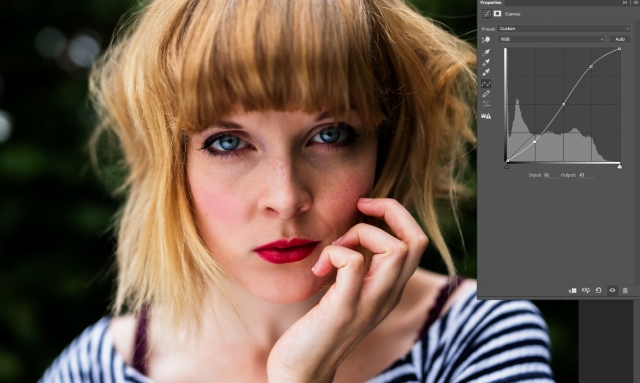
This here is a super basic JPG, sans any kind of colour edit. If you look at the little grey box to the right of this screenshot, you’ll see what appears to be a histogram on a grid with a line throught it. The grid is divided into four boxes across, each box representing a tonal range. From left to right, these boxes / sections represent the following tones:

Shadows -> Mid-darks -> Midtones -> Mid-highs – Highlights

Now, looking at the verticals on the grid, we can establish how much of each type of tone we have already in the image. The higher the level on the histogram, the more of that tone there is. Looking at the histogram for this example image, I can see that there is a spike in the quarter representing shadows to mid-darks but next to nothing in the mid-highs to highlights, so none of the tones in my image are blown out to white or pure-black. Make sense? Understanding the tonal range of your image is part of the key to perfecting your use of the curves tool, because the next step is manipulating it. Oooer.

Screenshot 2016-01-26 16.15.37.jpg

You can use the RGB channel of the curves layer to accurately tinker with the contrast levels in your image. One of the most common ways of doing this is by creating an “S-shape” curve. Click right in the centre of the grid to begin with and you’ll see a little dot appear – this has now anchored your midtones. Next up, click and drag the line down on the mid-darks area to make them darker and then click and drag the line up over the mid-highs area to boost those and make them brighter. See how crazy contrasty that just made things?

Screenshot 2016-01-26 16.16.04.jpg

On the other hand, you might want to make your image somewhat less contrast-tastic. If this is the case, anchor those mid-tones again and then click and drag the line up from the bottom left corner to make the shadows (and everything up to that midtone anchor) lighter, then click and drag the line down from the top right corner to make the highlights (and everything from the midtone anchor) a bit darker.

Screenshot 2016-01-26 16.19.16.jpg

If you want to really start being brave and adding more points to warp your image tones, here’s a little peek at the RGB channel points I’ve used to create a slightly filmic overall tone. I’ve dragged some of the mid-darks down to create contrast, but also opted to bring the shadows up and the highlights down a bit to add some vintage-style fade to the effect. The best thing to do is just have a play and see what effects you can create by wiggling various points around on the graph. Sometimes it’ll look dreadful, sometimes it’ll look mega – don’t be afraid to experiment here.

Hopefully you’re starting to see how super freakin’ powerful this adjustment layer is / understand where the main tone points are now? Yep? Good, because the next step is:

Colour Toning

Ohhh yesss! As if the contrast tricks weren’t enough, you can also use curves to do beautiful things to the colours in your image. This adjustment just keeps on giving.

Screenshot 2016-01-26 16.20.21.jpg

First of all, you’re going to need to find the “red” channel on the adjustment layer. If you look just above the graph where it says “RGB” you should see a little arrow on the far right of that box? Click that and scroll down to the “red” option to select our new colour channel of choice. Fun colour times, here we come.

Now, in the same way that shadows are opposite to highlights on the grid, each of our colour channels has its opposite colour. Learning these will ultimately help you out with a huge number of other colour editing tools, not just curves, so they’re well worth memorising. Here’s what you need to know:

Red – Cyan

Green – Magenta

Blue – Yellow

Screenshot 2016-01-26 16.20.44.jpg

Let’s start with red. Any point now pulled upwards or left will increase the amount of red in that tonal area. Any point pulled downwards or right will therefore increase the amount of red’s opposite colour, cyan, in that tonal area. In the above image, I’ve set the midpoint once again and pulled the shadows end of the red right up – can you see how the shadows and mid-darks have now taken on a much redder hue?

Screenshot 2016-01-26 16.20.57.jpg

To then do the opposite, keeping that midpoint anchored, I’ve dragged the highlights point right down. All of the mid-highs to highlights are now somewhat cyan-tinted.

Screenshot 2016-01-26 16.21.32.jpg

If I wanted to be a bit more subtle and just give a slightly warmer red tint to the shadows only, I could add another anchor point over the mid-darks intersection and then drag the shadows point slightly upwards. Using those same / similar anchor points I could also choose to give the shadows a cyan tint by dragging the shadow point to the right across the bottom of the graph.

This colour opposites theme continues through the “Green” and “Blue” channels. I’ll not show you the extremes of each because the theory remains the same as above, but here a couple of my personal favourite tricks:

Screenshot 2016-01-26 16.22.09.jpg

For slightly pinker highlights, select the green channel and set an anchor point or two over the midtones and mid-highs, then drag the highlight end down. This increases the magenta in the highlights and can do lovely things to skin tones if done subtly enough.

Screenshot 2016-01-26 16.23.13.jpg

If you wanna get super vintage about things, get yourself over to the blue channel right now! For that dreamy vintage / slightly fairytale vibe, push the shadow point right up and pull the highlight point down, midtone anchoring optional. I usually tend to go for the slightly more subtle option here, which is just to slightly tint with this technique:

Screenshot 2016-01-26 16.23.45.jpg

And there you have it! Photoshop Colour Curves in a few easy steps. Hopefully it made some modicum of sense and I haven’t just confused you further. If there’s anything you’d like clarification on or if you think I’ve made any glaring omissions in this guide, hit the comment button! Tutorials are a totally new thing for me, so if there are any ways in which I could improve here, I’d genuinely appreciate your feedback.

Love to the lot of you,

E x


P.S. If you edit something awesome using what you’ve learned from this tutorial, I’d LOVE to see it! Send me your Flickr / FB links or just post your work in a comment.

P.P.S. Fancy getting your paws on one of my own colour curve presets? “Waiting For Spring” has been created especially to go along with this blog. All you’ve got to do is (publically) share your favourite image from my Facebook page and then send me a message on there to say you’ve done so. Simples! Here’s what I’ll send you in return:

Cat Lane - Waiting For Spring example.jpg

Cat Lane = total babe.

Bargain. Enjoy!


Musicians: Tips for the best possible design experience.

I’ve had the genuine delight of being involved with quite a few gorgeous albums now. I’ve loved the challenge of coming up with lots of new concepts and stretching my creativity, experimenting with new techniques and working with a range of clients. However, there are a few things which regularly crop up which can a) turn the simplest job into an entirely different beast and b) be so easily avoided with the right prior knowledge. With that in mind, with the aid of my lovely design compadres KT Coope, Louise Bichan and Simply Marvellous, I thought it might be an idea to make a check list of a few things to consider when collaborating with a designer for your album / EP / single / general promotional artwork. Hopefully we’ll clarify a few of the terms that get thrown around and provide you guys with a kit for the most awesome design experience possible. Beauteous design times, here we come!

(…before we start, this blog is not written with the intention of being at all patronising, neither is it taking a prod at any previous clients. It’s just a few things we’ve picked up along the way that your designer will most likely thank you for, and that will hopefully result in your end product being the absolute best version it can be.)

Ready? Here we go!

113

  • Have you supplied us with the correct templates from your printer of choice? It may seem obvious, but think about what kind of packaging you want in advance: Do you have lots of text you’d like including? If so, should you go for a booklet? Do you want a four panel, six panel or eight panel digipak or digifile? It’s worth doing a bit of research and looking at a few different albums to decide what kind of physical packaging you’d like. If you’re not sure what the specific package type is, take a photo of it and ask your printer or designer. (Alternatively, ask your designer to deal with the printers directly once you’ve been in touch about a quote and packaging type.) It’s also worth considering what type of finish you want on your packaging: gloss (shiny) / satin (mostly matte with a slight shine) / reverse board (super matte and lightly textured)? All of these will, to some extent, affect the design and overall mood of the album art.
  • Have you sent us the hi-res versions of your photos / artwork? Ensuring that your designer has the high resolution versions of the images will give them much more freedom to be creative with your design, allowing them to crop into images without pixelating problems. For a quick explanation of hi-res vs low-res, keep scrolling!
  • If you want a piece of original artwork incorporated into your design, make sure you acquire either a hi-res scan of the piece, or a hi-res photo taken on a decent quality camera (preferably a digital SLR set to a high f/ number, low ISO and positioned on a tripod somewhere with even lighting). I’d recommend you ask a professional to take the photo if you’re unsure.

112

  • The sooner the designer has your audio, the better they can use it to drive the feel of the design and make sure it really fits it. We don’t need the super final master versions, just something to make sure we’re going to get the right vibe. (Plus, y’know, it’s pretty exciting getting sneaky previews. But mostly the first thing.)
  • If you have a particular theme to the album, tell your designer all about it! We’re far more likely to hit the proverbial nail on the head if you give us some kind of headstart with your concept ideals. If you’ve not got anything recorded yet, send us a few choice lyrics and a few descriptive words, so we can at least get the cogs whirring while you’re in the studio. If you’re not a fan of the ideas your designer is suggesting, try and articulate why and what sort of thing you might prefer; if you can’t quite explain but have some kind of visual reference, send that over! Pinterest is a great place to create a collaborative mood-board (i.e. a collection of images / colours etc which you feel fit to your album theme) and can be endlessly helpful to help us get an idea of what sort of thing you might be after.

90

  • Proof read your sleeve notes! And then get someone else to proof read them. And then get someone else to proof read them again before you send them over. Every time sleeve notes are changed, the chances are your designer is going to have to re-typeset them, so please be as sure of them as is possible before sending anything over.
  • CD covers have less space than you think. While it’s lovely to want to thank lots of people, if you’re not concise about it the chances are it’s going to need to be cut down if you don’t want tiny illegible text. If you do want to write lots of content, whether it’s thanks or anecdotes or additional background to the songs, make sure you choose an appropriate booklet length to compliment it. If we have to make the text tiny to fit it all in, it can get hard for people to read and will also need a very simple background, which unfortunately also cuts down what we can do with the artwork. If you want to give people access to the lyrics but would rather have more images than text in your artwork, perhaps consider adding a lyrics page to your website and directing fans there?

20s

  • Remember, your album is likely not the only project that your designer is working on. So if you send a change that you think will only take an hour or two, that hour or two might need to be later in the week because of other work. Please also bear in mind that if your project runs over deadline through no fault of your designer, any changes will need to be done around their new projects / eating and sleeping. If you want a rush order, the pricing will almost definitely need to reflect that accordingly.
  • If there are multiple people in your group who would like to give feedback on an artwork draft, the most efficient way of ensuring all your voices are heard is to discuss it amongst yourselves and then send over a list of your collected thoughts. There’s little more confusing than being in the middle of an email exchange between multiple parties with differing opinions.

7s

  • To ensure the prompt delivery of beautiful, cohesive artwork, the most helpful thing you can do is to send your designer everything they need, proofed and ready to go, at the same time. Try to think of the design as one entity. If you send the elements through in dribs and drabs, the process can become frustratingly patchwork and it’s almost impossible to lay out ahead of knowing, for example, exactly how much text we have to fit in around what images. If we can see, straight off the bat, what we need to fit into the template, the design experience at this end is more like this:
Iron-Man-Movie-Prologue-Hologram-2

IRON MAN STYLE. (Slight exaggeration, but you get the picture. Man I’d love a computer like that.)

  • Finally: Set yourself a realistic deadline for the project, and make sure you get everything over to your designer in plenty of time. Albums take time to do properly! I say this as someone who has been involved with a number of them musically, photographically and in a design capacity. If it’s possible for you to do so, I’d suggest that your best option scheduling-wise would be to set a recording deadline and then set an additional two to three weeks for the artwork after your recording deadline. This gives you a bit of flexibility for the almost inevitable extra tweaks to the tracks, and your designer a decent amount of time to put things together for you without having a sleep-deprived meltdown. This length of time also allows the luxury of discussing the artwork at various stages if needed, so you can feedback on the design as it progresses and get the best possible end product. Your design can actually help sell your albums, particularly to aesthetic magpies like myself, so try not to leave it to the last minute.


And absolutely finally, just in case it’s of some use, here’s that quick explanation of hi-res vs low-res without all the tech speak:

Check out the two versions of the tree root photo below. The one on the left has been cropped from a hi-res photograph (5760 x 3840 pixels, 240dpi). Notice the sharp details and crisp lines?

Hi res vs low res

Conversely, the one on the right is from a low-res version of the same photograph (1400 x 933 pixels, 72dpi) stretched to fit approximately the same dimensions as the above image. See how the details have become much more fuzzy?

Hi-res photos will usually have pixel dimensions in the several-thousands and a dpi of 240+ (ideally 300dpi for print). These high quality images give us the chance to crop into them to re-compose or pull details for elsewhere in the artwork, without running the risk of the image pixelating and consequently cheapening the design. If you have beautiful photos or artwork and want it to print in a way that does proper justice, always go hi-res!

Whew. I think we all deserve this photo of Hudson the wonder dog at this point:

1 Winter (1)

And that’s it! Hopefully these points are of some use to someone. As I said, these are just a few bits and bobs that we’ve particularly picked up on whilst working on albums and obviously we know and understand that sometimes things happen that are out of your hands, but if there’s anything you’d like to add / would like more clarification on, hit the comment button. Thanks for reading!

Until next time,

E x

P.S. The “behind the scenes” photos slotted into this post were taken during the documentation of the incredible Elizabethan Project, run by those nice folk over at EFDSS and Folk By The Oak. If you fancy seeing more photos from the project, it has its own blog right here.